
IPM Tech Pest Control
How I designed a mobile-first, full website redesign focused on targeting B2B clients while increasing conversions and driving revenue.
Overview
IPM Tech Pest Control is a Los Angeles–based service company primarily serving B2B clients.
Under new ownership, the company required a rapid digital overhaul, as its existing site functioned as a static landing page with no lead capture strategy, limited information architecture, and minimal user flow consideration.
The objective was to redesign the platform into a conversion-focused, mobile-optimized experience—strengthening content hierarchy, improving usability, and implementing marketing integrations to support scalable growth and future B2C journey expansion.

Key Takeaways
Users needed a clearer, mobile-first experience with defined pathways to the client portal, services, and contact options. The redesign need to strengthen information architecture and streamlined key user flows, while integrating lead capture tools to support discovery, conversion, and long-term growth.
Usability Pain Points:
The previous site lacked structured navigation and consistent hierarchy. On mobile, poor typography and spacing reduced readability, while buried CTAs disrupted flow and contributed to quick exits.
Analytics Findings:
Analytics revealed high landing-page bounce rates tied to low-visibility CTAs. Users clicked non-interactive images, expecting navigation, and fewer than 10% of new visitors reached the contact section.
User Behavior Insights:
Cramped visual hierarchy and an inconsistent layout made primary CTAs difficult to find. The primary service section lacked contextual clarity, creating confusion and increasing the likelihood of user drop-off.
Research and Discovery
I conducted a full audit of the existing website, evaluating its features, user flows, and information architecture. The analysis revealed a lack of mobile optimization, no clear service-area pathways, and a fragmented booking experience—particularly on mobile devices. Overall, the site lacked a defined content hierarchy and intuitive navigation structure.
The Question:
How might we design a conversion-focused platform that increases lead generation while delivering an intuitive UI, allowing both new and returning users to quickly access services and essential business information?
The Goal:
Design a modern, growth-focused website with a streamlined user journey, clear information architecture, and direct pathways to services and consultations—reducing friction and minimizing repetitive support inquiries.
The Problem:
IPM Tech’s website failed to meet core user needs. Customers encountered dated UI, while the platform lacked lead capture systems and marketing integrations to support discovery, conversion, and scalable growth.
Define The Problem
The Solution
I rebuilt IPM Tech’s website and digital marketing funnel from the ground up to prioritize B2B lead generation while supporting targeted B2C expansion. The redesign strengthened information architecture, improved SEO foundations, and streamlined user flows within a modern, mobile-first interface—ensuring a seamless, high-performance experience across all devices with the customer at the center.

Key UX Decisions
During the prototyping phase, early iterations revealed the need for clearer service segmentation to better support B2B acquisition. Each core service was given a dedicated landing page, with location-specific pages created to align with user intent and improve search visibility. This structure strengthened information architecture, reduced ambiguity, and supported future PPC campaigns while providing clearer context before inquiry.
We also prioritized returning customers by elevating access to the client portal. The login, previously buried among competing CTAs, was repositioned within the primary navigation to improve visibility, streamline task completion, and reduce friction for ongoing users.
Implementation
I translated the high-fidelity Figma prototype into Wix Studio, implementing a mobile-first experience, streamlined distributor structure, and updated component system into a fast, responsive build across all devices.
Desktop Experience

Outdated layout, inconsistent branding, unclear visual hierarchy, and buried CTAs led to confusion, reduced usability, and elevated bounce rates.

Modern UI with refined hierarchy, and strategically placed CTAs—creating a streamlined, conversion-focused experience that improves engagement.
Mobile Experience

Non–mobile optimized layout, cramped typography, unclear CTAs, and low-visibility access for new and returning users—creating friction across user journeys.

Improved spacing, stronger visual hierarchy, and a mobile-first interface that makes tasting room details, events, and product discovery easy to navigate.
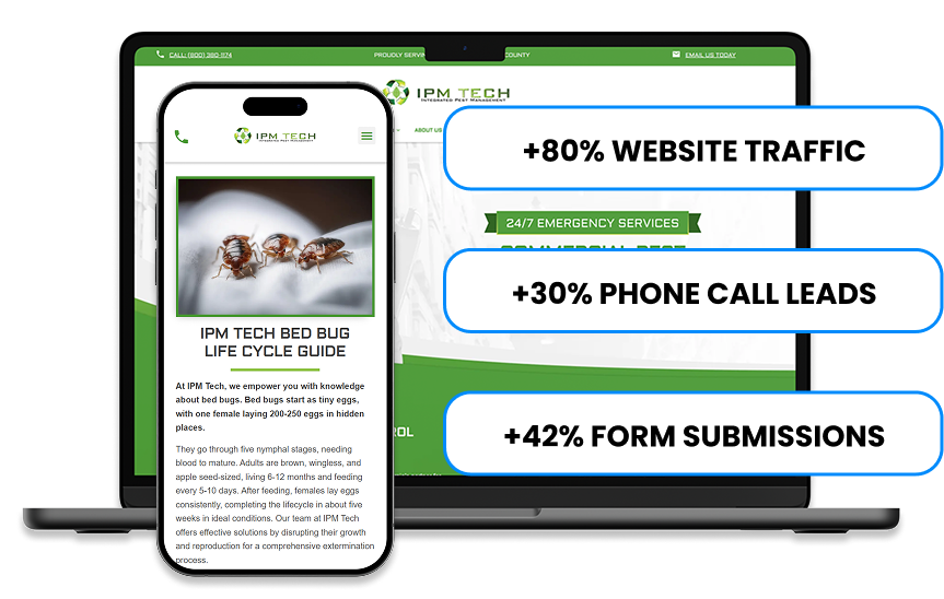
The Results
The redesigned website accelerated overall brand growth within its target service areas, increasing both B2B and B2C lead generation while strengthening search visibility and organic discovery.
Measured improvements
-80% increase in website traffic
-30% increase in phone call leads
-42% increase in form submissions
-Clearer mobile flows that reduced user friction
-Verified, consistent content across all location pages
-Modern UI that improved readability and task completion

Web Design
The redesigned platform integrates refined navigation, optimized user pathways, and performance-driven marketing systems into a cohesive, mobile-first experience. Built to support scalable growth and improved lead generation, the site now functions as both a service hub and acquisition engine. View the live site below to experience the transformation firsthand.